Animated Premier League Table
For my inaugural blog post I decided I would step into the world of animated graphics for the first time. I was inspired by the presentation that Thomas Lin Pedersen gave at the useR! conference on gganimate and was motivated to create my very first gif.
I rooted around for ideas and decided upon creating an animated table of the Premier League for the last season, with the clubs being depicted by their crests. A quick google pointed me towards a free football API and that was already an R package to interface with this API. NB: This API has since been updated to v2, which isn’t currently supported by the linked package, but is perfectly fine for the historical dataset I wished to extract.
So the first thing we need to do is install and load the relevant packages:
install.packages(c("tidyverse", "ggimage"))
devtools::install_github("thomasp85/gganimate")
devtools::install_github("dashee87/footballR")

library(tidyverse)
library(footballR)
library(gganimate)
library(ggimage)
Now as I wished to make multiple calls to the football-data API, I registered an account that would give me an API token key. Then I set this key in my script (not shared for obvious reasons.
my_token <- "xxx"The fdo_leagueTable function would give me the final league table data for any competition, for any competition id I provided. The id for the Premier League 2017/18 season was 445. However I also wanted to get the league table positions for all 38 match days, so I needed to iterate through multiple API calls, varying the matchDay argument. Firstly however I wanted to define the function beforehand so the result was a tidy dataframe, allowing me to utilise the purrr function map_rdf.
import_tidy_table <- function(x){
  data <- fdo_leagueTable(id = 445,response = "full", matchDay = x, token = my_token)
  data <- data$standing
  data$`_links` <- NULL
  data$home <- NULL
  data$away <- NULL
  final_data <- data
}
Next I iterate through the first 19 matchdays first, to not call upon the API too many times within a single minute. (I’m sure there must be a better way of doing this)
first_19_matches <- map_dfr(1:19, import_tidy_table, .id = "match_day") %>%
  mutate(match = as.numeric(match_day))
Upon waiting a minute I run again for the second half of the Premier League season, not forgetting to add 19 to get the correct match day value.
last_19_matches <- map_dfr(20:38, import_tidy_table, .id = "match_day") %>%
  mutate(match_day = as.numeric(match_day) + 19)
As I want to start the graphic at the beginning of the season, I create a dataset where match day is 0 and bind all my data together. Additionally I a new column, img, which is the path to each teams crest and I turn match_day into an integer, for better showcasing in my gif title.
data <- first_19_matches %>%
  filter(match_day == 1) %>%
  mutate(match_day = 0) %>%
  arrange(teamName) %>%
  mutate(position = 1:n()) %>%
  bind_rows(first_19_matches) %>%
  bind_rows(last_19_matches) %>%
  mutate(img = paste0("logos/", teamName, ".png")) %>%
  mutate(match_day = as.integer(match_day))
Now the final section of code will be used to create my animation!! I pass my data to ggplot, with x being the match day and y being the position. I then pass the crests, from the img variable, to the geom_image function and add match day to transition_time so the crests will move along the x axis. I tried a few variations around this, with x being the team name for example, but I felt this combinated offered the best output. Next I create a set of coloured blocks to represent the winner, those teams that qualify for the Champions League and those teams that are relegated. Finally I reverse the y axis scale to depict the winning team at the top, which seemed much more logical.
ggplot(data, aes(match_day, position)) + geom_image(aes(image = img)) + theme_bw() +
labs(x = "Match Day", y = "Standing", title = '2017/18 Premier League - Match Day: {frame_time}') + transition_time(match_day) +
geom_tile(alpha = 0.05, aes(x = 19, width = 40, y = 1, fill = "a")) +
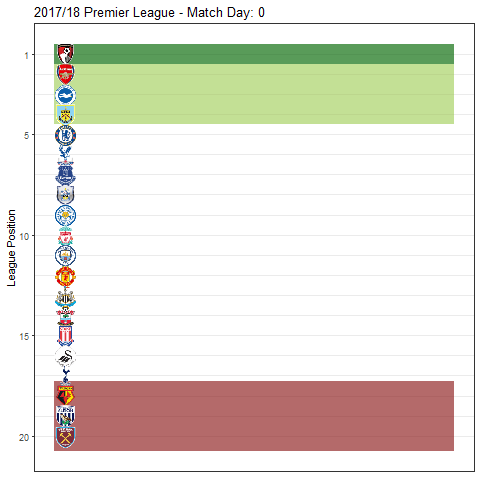
geom_tile(alpha = 0.05, aes(x = 19, width = 40, y = 3, height = 3, fill = "b")) + geom_tile(alpha = 0.05, aes(x = 19, width = 40,y = 19,height = 3.5, fill = "c")) + scale_fill_manual(values = c("darkgreen", "darkolivegreen3", "firebrick4")) +
scale_y_reverse() + theme(legend.position="none")Animated Premier League 17/18 Table
So there we have my animated Premier League table, a fairly good result for my first try. Two particular areas I want to improve are:
- The image quality of the crests is quite low, I did improve this somewhat by finding smaller .png files, but there is still plenty of room for improvement.
- I think a coloured line that follows behind each team’s crest would add a lot to this animation. I did spend a little time trying, but the line only appeared for the current match day.
P.S. As with all attemps to create a final output, there were plenty of abominations along the way. As it’s important to show your failures, as well as your successes, I’ve inserted a couple of them below.
Abomination 1
Abomination 2